PERETTI
Visual identity for italian food store
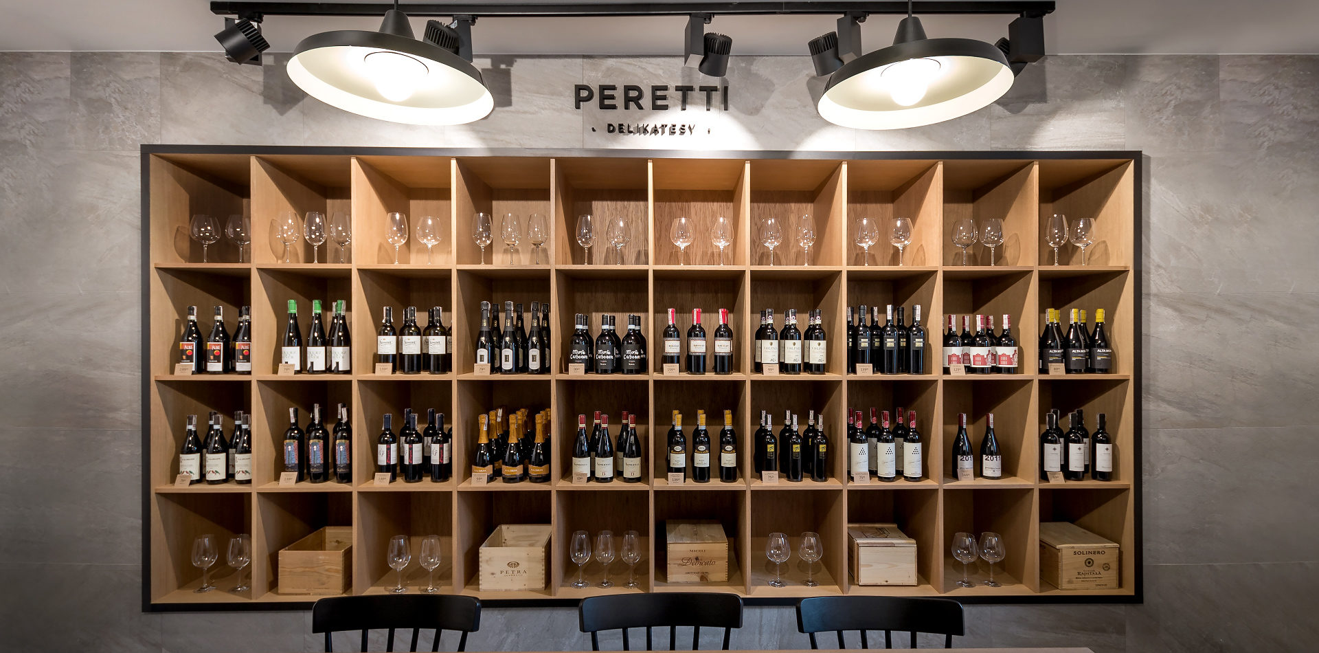
Italian Delicatessen Peretti is a new standard among delicatessen stores in Poznan. All products in the shop are characterized by high quality and Mediterranean origin.
The design task was to create a visual identity of the brand from scratch. The expectations were simple – it was supposed to be elegant and unconventional, which was fulfilled by the monohromatic character of the project. The offer is addressed to wealthy people who care about the quality of the products they buy and the impeccable service. Thanks to close cooperation, we have managed to achieve a coherent end design that meets expectation of clients.


If your mother cooks Italian food, why should you go to a restaurant?
Martin Scorsese


The project was carried out in three stages. The first step was to create a logo and visualize the basic promotional materials. From the 3 totally different proposals, the most minimalist had been selected. This version suited to the customer profile the most. The next step was to create graphic elements for the shop interior. Among them were information signs, a wallpaper pattern and an Italian map showing where products are produced. The biggest challenge was the map design, which in spite of large amount of information still had to remain legible and very aesthetically pleasing.


1 Logo design
Minimalist and sleek as possible. This makes readability and scalability of logotype very high.
2 Pattern design
Thanks to the simplicity of the logo, it was possible to add a very strong complementary element to the identification - the pattern. It adds freshness and energy to the entire brand.
3 Colors choice
As simple as logo design - only white and black.
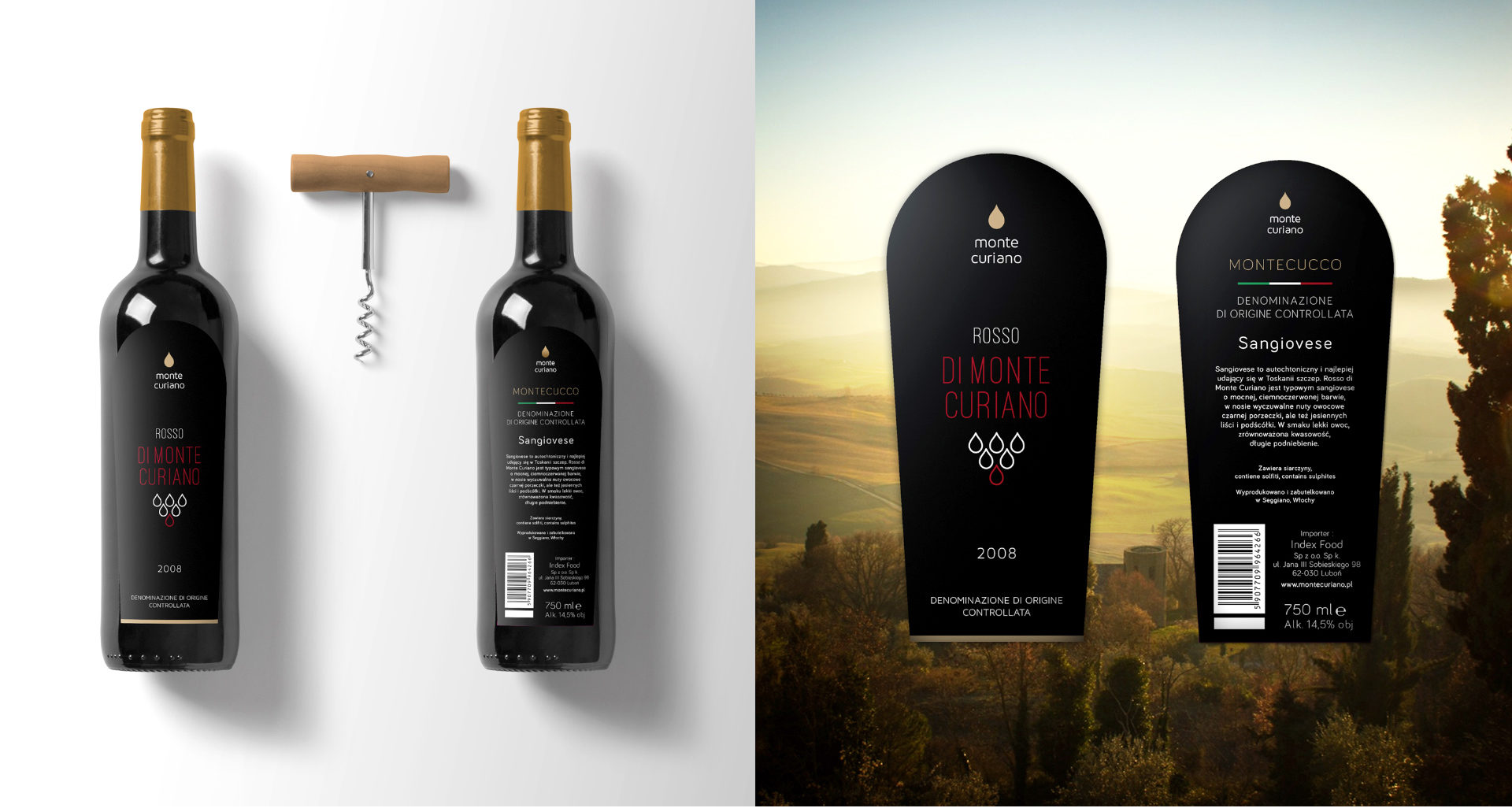
Delikatesy Peretti owns the Monte Curiano brand. Until now, only olive oil from that brand was available in Poland. With the decision to open the store, it was decided to spread the Monte Curiano assortment of Italian wines. Thanks to that, the design of the label of wine was given to us .
The most important assumption of the wine label design was aesthetic coherence with the existing product – Monte Curiano Olive Oil. Its label is characterized by the simplicity, which we continued in the wine label design. The icon representing the droplets also refers to the icon used on the oil. What distinguishes the two projects is the usage of burgundy color.
